I’m going to preface this article by stating my thoughts are only opinion and by no means are any of these choices an objective correct answer. These albums are also ranked in no particular order since I think each has its merits for why it stands out. With that in mind let’s discuss my personal thoughts on some of the best album art of all time.
To start, what really makes an album artwork stand out? Is it the meaning behind the art? Is it the quality of the art itself? Is photographed or hand-drawn art better? You’ll probably immediately be able to tell as soon as you start looking down this list that there is a common theme of “creepy” or “unsettling” artwork. Though I could title this list, “Most Unsettling Album Artwork”, I don’t think my answers would have much depth beyond just “unsettling”. I can’t really explain why, but for some reason I find strange album art to be the most fascinating.
Without further ado, let’s begin:
In The Court of the Crimson King - King Crimson
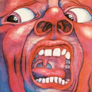
This album is a classic, not only sonically, but artwork wise as well. One of the most influential prog-rock albums of all time couldn’t be encapsulated better than a beautifully drawn screaming face.
JEFFERY - Young Thug
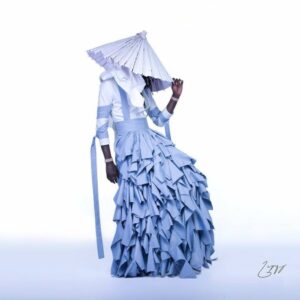
When you think of standout modern hip-hop album artwork there are a few that come to mind. My Beautiful Dark Twisted Fantasy by Kanye West and To Pimp A Butterfly by Kendrick Lamar are the two go-to choices, but I actually decided to go with one of my favorite guilty pleasure artists, Young Thug. Repping a fit created by Italian fashion designer Alessandro Tricone, Thugger kills this gender-bending look. Choosing to hide his face and let the color palette and clothing design do the talking, this album art is a good reflection of JEFFREY and Thugger’s approach at trying to broaden his sound.
Fetch - Melt-Banana
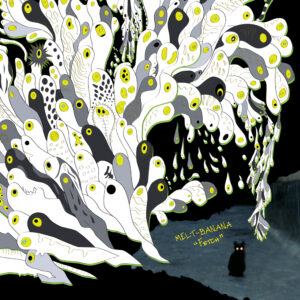
I can’t even begin to describe what’s happening in this album artwork. Something about fish-like ghosts traveling around a spooky looking cat with glowing yellow eyes? Stylistically I just love how everything looks hand-drawn and almost every fish-ghost is completely different from another in some way. Also, the black, white, grey, and yellow color set works really well combined.
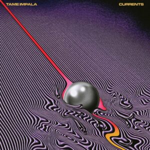
Currents - Tame Impala
Alright, everyone should have seen this one coming.
I’m not a huge Tame Impala fan (I don’t even know if I would consider myself a fan), but this album artwork is super trippy and a spot on representation of the album. Where as the album artwork for Kevin Parker’s first LP, InnerSpeaker, really sells the psychedelic vibe, Currents on the other hand takes that and throws it into a futuristic blender.
According to the artist of the album artwork, Robert Beatty, “Kevin’s idea for the album artwork were all based on turbulent flow, the the way liquid or air flows around objects. He sent over a bunch of images of diagrams that I took inspiration from. Everything was very open and they let me interpret things in my own way.”
Just like Parker’s album, there is a cohesive flow with every song and each one is open to interpretation.
Get Real - Math the Band

Similarly to Melt-Banana we have another artwork that looks hand drawn, but unlike Fetch we have a pastel/graffiti feel. This strange cat of some sort is absolutely gnarly, with pink and red lines stemming from its pupiless eyes and grotesque face. The art also goes perfectly well with the insanely aggressive Nintendocore sound of the group.
Cocoa Sugar - Young Fathers
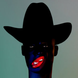
Now we’re getting into creepy territory. Though I personally don’t find this album artwork too unsettling, I think it’s just uncanny-valley enough. I’d like to think this is a computer created image, but it looks so real (hence the uncanny-valley). The top-down lighting change from the pitch black cowboy hat to the navy blue skin is shadowed very well. Another stunning point are the red lips that contrast the dark color of the artwork. The aesthetic of this album art is very reminiscent of a darker version of Grace Jones’ Nightclubbing.
Filth - Swans
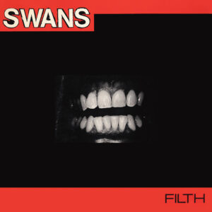
What’s creepier than the dark? A pair of ferocious teeth being the only thing visible in the dark. Not only is this album artwork unsettling, but it is a perfect reflection of the grim lyricism and industrial production from the experimental rock band. For a debut album, Swan’s overall sound and album artwork knocks it out of the park.
Grow - Bedroom
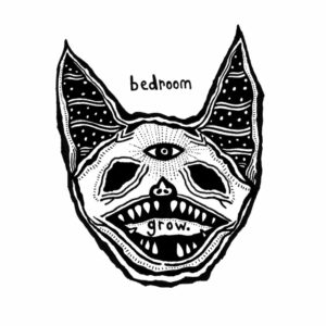
Who thought a band so soft sounding could put out an album art so horrifying. The slow “sad boi” instrumentation is completely juxtaposed by this album art, yet at the same time the lyricism and themes of the album complement it so well. I won’t lie, I’ve cried a couple times while listening to this album alone in my apartment and I’m not embarrassed to admit that.
Loved - KEN Mode

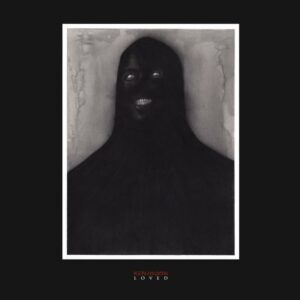
Just when you thought Cocoa Sugar had the scariest album artwork of 2018, Canadian noise rock trio, KEN Mode, arrived. With what looks to be a framed photo of something one could only see during the horrors of sleep-paralysis, this album art takes the cake as one of the best for just how unsettling, creative, yet minimalistic the design is. You have zero idea what or who this figure is, but all you can see is their glaring white eyes and fiendish teeth.
As it turns out, this artwork was actually created beforehand by a friend of the band, Randy Ortiz. The title of the artwork is, “Happy Person Having A Conversation In Public”, which simply oozes sarcasm and is reflective of Ortiz’s social anxiety toward dealing with stress in a public space. As funny as my joke about a sleep-paralysis demon was, Ortiz actually came up with this design because he has seen this figure in both his nightmares and during sleep-paralysis. This album artwork also beautifully reflects the sound and themes of the record, as stated best by Ortiz himself:
“Just look at the illustrations and listen to the music – they are made for each other. A guttural mess covered in spit-moistened charcoal. The crunchy grit I felt in my teeth as I inhaled the black carbon and ash from making this work, representing the noise they’ve created but exhaled and shot out in reverse. It’s perfect."
No Love Deep Web - Death Grips

This wouldn’t be a gavtunes top ten if I didn’t mention Death Grips now would it? Though there are plenty of amazing Death Grips album art to choose from, I thought it would only be fair to pick one. Even though I have both Bottomless Pit and Year of the Snitch up there for two of my favorite artworks of all time, I had to go with No Love Deep Web for its hilarity and story behind it. For those who can’t tell what is depicted due to the censorship, let me break it down. What we have is Death Grips drummer Zach Hill’s genitalia with the words, “No Love Deep Web” written in sharpie. No, I’m not lying, that was indeed the original album art before it was censored commercially.
The story behind the album art is that Death Grips signed a contract with Epic Records and were promised they would be able to release two albums within the 2012 year. After the success of their April, 2012 album, The Money Store, many were very excited for what the group would do next. Unfortunately, for unknown reasons Epic Records decided to go back on their agreement with the band and told them they would have to postpone their second LP’s release date until 2013. Of course the group wasn’t happy with this news, and so they decided to purposefully leak the album in October, 2012 and used the artwork as a big middle finger to Epic Records. The band was dropped from the label and within the coming years they formed their current label, Third Worlds.
Did I miss any of your favorite album artworks? Comment down below and let me know your thoughts on this list and what you would have added.